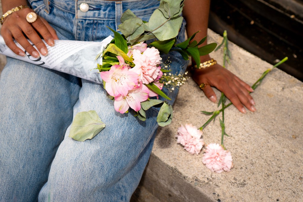
Ask any of my friends, they’ll tell you red is my color. An unreasonable proportion of my wardrobe boasts the color, and I reached for my red scarf a few too many times during winter quarter. At this point, it almost feels like an extension of my identity, and is undeniably a signature in my current style.
Given this fixation on the color, it is no surprise that as I scrolled through my YouTube homepage and began to see recommendations for personal color analysis, my interest was piqued. Clicking on these videos, I watched individuals visit “color consultants.” These consultants would drape multicolored cloth swatches across their clients shoulders, raving when a color suited their complexion and almost comically throwing out the swatches that they claimed emphasized wrinkles, dark circles, or redness.
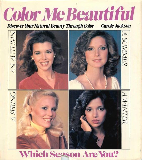
Scientists, philosophers, and artists have been studying color for centuries, and color analysis is just one extension of this work. It was first brought into the mainstream in the 1940’s by Suzanne Caygill, a fashion designer. Caygill was the first to develop seasonal color palettes, which were adopted by style consulting companies at the time. Color Analysis experienced a peak in popularity during the 1980’s, with the release of the bestselling book Color Me Beautiful by Carole Jackson.
In its most recent revival, the popularity of color analysis stems from Korean beauty professionals who post their consultations online, like the ones I stumbled across. This newfound popularity is fueling tourism in East Asia, as color consultation shops open across Korea and Japan.
As I watched more of these videos, I began to understand the theory behind personal color analysis. The four color “seasons” are the foundation of color analysis. While the exact approach varies between color consultants, there are cool-toned seasons: Winter and Summer, and warm-toned seasons: Fall and Spring. Then within each season, colors can vary by value (how light or dark a color is) and chroma/saturation (the intensity of the color). Taking all of this into consideration, each client is assigned a season based on their undertone.
If you have taken an art class before, you might recognize these elements of color theory. Granted, this is a pretty bare-bones description. Within just a color’s value there are tints and shades and hues– it all gets quite complicated. The end goal, of course, is to find the most flattering colors for an individual based on their undertone. These colors can then be incorporated into personal wardrobe or makeup collections.
As I continued to watch these videos with my newfound knowledge, I began to play along with the consultants. Trying to predict whether a swatch would be deemed a “good” or “bad” fit for the client proved to be impossible. A color I loved on the client was thrown to the side, and a color I shied away from was met with enthusiastic approval.
Perhaps my personal color preferences were influencing my guesses, or perhaps the entire color analysis technique was built on a shaky foundation.
While the existence of warm and cool undertones are widely accepted, and a useful concept in both art and fashion, trying to whittle down a perfect color palette is futile. Realistically, it is impossible to implement. Are you really going to throw out your favorite shirt because it does not fit into your designated color palette? Or pass up on the perfect jacket because it doesn’t suit your undertone?
Coming back to these videos with a slightly more critical eye, I think I have settled at a happy medium. Think of color analysis as the zodiac signs of the fashion world– fun to indulge in, but not something to take too seriously. On one hand, it could be a good tool for fashion exploration. It could act as a guide for unique color pairings. Try challenging yourself to wear a color outside of your comfort zone, but within your seasonal color palette. Keeping a seasonal color palette in mind could also be helpful while building a capsule wardrobe. With a limited number of pieces, cohesion through color is important.
With that said, setting restrictions on personal style, or any form of self expression, prevents true creative freedom. If you choose to delve into the world of color analysis, it should be seen as a guide, rather than a set of rules. Have fun with it!
While I have not truly implemented my color season (autumn, in case you were wondering) into my closet, I do like to use it as an excuse for wearing red so often. Just know this: If I ever find myself in Korea, I’m booking myself a color analysis appointment.
Reach column writer Nicole Roberts at musemediauw@gmail.com
Instagram @niicoleroberts